Thursday, May 28, 2009

Why Mrs. Howard, I believe you’re trying to seduce me….

In my opinion, nobody does bedrooms better than Phoebe Howard. When I was in Atlanta earlier this month, I was so excited to have the opportunity to visit her beautiful store at the Galleries at Peachtree Hills—the eponymous Mrs. Howard. My initial thoughts were: “How can I pack this all up and get it back to California?!” (The next thought was how to explain to my husband the Visa bill that would follow.)

The entire shop is gorgeous, but the bedrooms are to die for.

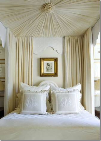
MrsHoward_002

This serpentine stairway connects three floors of delightful vignettes. (My husband called to check in on me while I was standing on the landing to the left—I told him I had found my new home!)

MrsHoward_025

This photo from Phoebe Howard’s website illustrates some of what I love about the bedrooms she designs….

The color palette is kept very tight, with layers of neutral ivory, oatmeal and sage green. Although there is a good deal of pattern in the fabric-the checked upholstered walls, the bed hangings, the accent pillows--it is done so subtly and kept within that tight color palette, that instead of appearing distracting or cluttered, it acts more like texture than color and adds interest while supporting the overall design. Metal accents are either patinaed gold or iron.

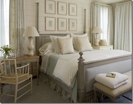
james 1

Here, Ms. Howard uses mismatched bedside tables, but unifies the design by: (1) keeping them in the same wood tone, (2) keeping the height uniform and (3) by placing matching lamps on top. The table on the left is given a bit of added “visual” weight by the addition of two candlesticks. I always love a sunburst mirror above a headboard and the setee/sofa at the foot of the bed is a design solution to remember when space permits.

081031_HowardBedrm_01

Instead of one large piece of artwork a grouped collection of smaller pieces fill the wall space above the bedside table.

081031_HowardBedrm_06 atlanta showhouse

These photos of the bedroom done for the Atlanta Showhouse show how details really make the difference. The scallop on that fabulous bed valance, though slightly different, is mimicked in the scalloped edge on the quilted coverlet and euro- shams. And, although it’s a bit difficult to see in the photos, there is a lovely beaded edge detail on both the valance and the bed skirt. Notice that the pale gold of the lampshade is repeated in the piping on the duvet all of which complement the gilded frames and accessories.

081031_HowardBedrm_07

And, I don’t even know where to begin with the monogrammed pillows…. The oatmeal colored linen, the micro-flange, the ivory inset banding, the large scrolled initials—perfection!

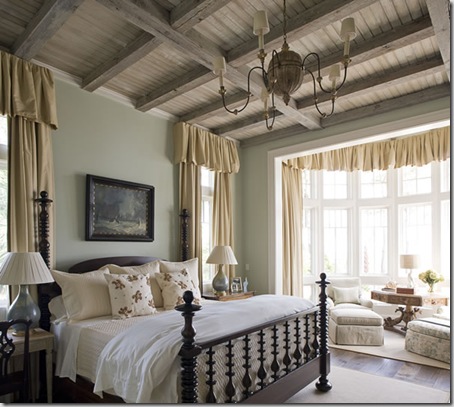
PH_Cashiers_098

Though this room is more country in feeling, the design process is the same—mismatched tables of similar height with matching lamps, a swedish bench instead of a setee at the foot of the bed. As always, beautiful detailing in the soft finishes-note how the ruffled skirt puddles. White or ivory sheeting, always. Very subtle pattern on the window treatments adds texture. Rather than a using sunburst mirror here, she uses another grouping of smaller framed pieces.

Following, are a few more photos of her work for you to enjoy….

DP09_27

Slightly more “cluttered” and decidedly English in feeling, this room has double box pleating on the bed skirt and window valance.

from mrs. h blog3

I am lusting after a chandelier like this.

from mrs. h blog

L.O.V.E. the shape of the headboard and I spy those delicious monogrammed pillows.

james 6

This is how I wish my boys room looked. So sweet.

james 2

Stronger colors and more contrast but equally beautiful.

These photos represent a just small sampling of what can be found on her website here, and on her partner in life and design-- James Michael Howard’s site here as well as on the Mrs. Howard Personal Shopper blog where you can also find photos of items for sale in her stores.

If you find yourself in Atlanta or Jacksonville, be sure to include a visit to one of her stores, you won’t be disappointed.

Monday, May 25, 2009

Souvenirs—Victorian Style

planning the grand tour

In the 17th to the 19th centuries it was common for young men from the nobility and upper gentry in England and northern Europe to round off their education by traveling to Italy and France.
They usually stayed for at least six months, but many travelers - often accompanied by a secretary and servants - spent anything up to two years away from home. The tour exposed them to what were regarded as the most important developments in science, culture and refined taste in Europe.
Initially, these journeys were the privilege of young men, but in the 19th century more and more women also undertook the Grand Tour.
Of course, no self-respecting tourist would return home without souvenirs. The English tended to dominate the market to such a degree that there was reportedly a saying in Rome that “Were our Amphitheatre portable, the English would carry it off.”
The wealthiest tourists could take home major works of art, such as sculpture, paintings and antiquities; those with more modest means could find lesser works of art and, perhaps, copies, including beautiful and highly portable plaster casts—intaglio: A term that antique dealers and designers have come to associate with these little gems, but which actually refers to the method of carving, rather than the end product-- similar to a cameo, carved in relief. The casts depicted great works that could be seen by a typical grand tourist and were arranged to evoke a typical tour.

c. 1820


Intaglio collection circa 1820
These mementos brought back with the travelers have become known as “Grand Tour souvenirs”, and illustrated the knowledge learned and were symbolic of refined taste. Upon returning home, these travelers exhibited them as objects for study and discussion, and as objects from which to derive status.
Today, these bits of history (and their reproductions) can be found quite easily (1st Dibs and Ebay are good places to start) and can add a bit of classical interest to any room.
homes-paris-inpsired-pebble-beach-2-0409-lg-16149457 
Framed Intaglios: Tiberian Design Framed Intaglios

Here, California designer Betty Burgess framed individual intaglio and covered her dining room walls—effectively using them as a layer of texture in a very neutral space.

DSCN0595


I found these skillfully arranged groupings at the fabulous Foxglove Antiques on Miami Circle in Atlanta. I love the linen mattes and simple frames.


02
Framed Intaglios: Tiberian Design Framed Intaglios


Designer Steven Miller used a grouping of intaglio collections in the dining room of the 2007 San Francisco Decorator Showcase House. As in the dining room above, a neutral palette gets a textural boost from these little beauties.
scan0003
Framed Intaglios: Tiberian Design Framed Intaglios


Once again the designer has chosen to frame a single intaglio in simple gilt frames, effectively making each individual one appear important.


1149_1_lg


Here is someone’s large collection of original pieces.
I have to say, when it comes to these groupings, I subscribe to the “less is more” theory . I think I would break these collections up into smaller, more symmetrically styled arrangements and mount them on sandy colored linen matte with simple gilt or fruitwood frames.
Whether artfully grouped or mounted individually, I think these souvenir pieces are a great way to add texture in a neutral space and are sure to spark conversation in any room.

Sunday, May 24, 2009

Shameless self-promotion

spiderman_6


Do you ever have an inexplicable, nagging feeling that you must do something? This doesn’t happen to me often, or maybe I’m just not very receptive to it, but once in a while my spidey-senses kick in.


Several months ago, I got an email from the NKBA about a student essay competition that was being co-sponsored by K+BB magazine. (I’m working on completing my kitchen and bath certification.)Normally, I quickly peruse the mail and file it away. But this one caught my attention. So, I made a mental note to try to come up with something to enter, and filed the email.


Naturally, I soon forgot my mental note. The following month I got another email from NKBA, reminding of the competition, and another note to self was made. And, again, it slipped my mind.


Then, one fine Saturday morning in late January, a synapse fired and I happened to remember that I wanted to enter this contest. I went to my NKBA file in my mailbox and much to my dismay, the deadline to mail was the next day!!! “You should just forget it, it’s too late now.” I thought. But the spidey senses wouldn’t let up and I figured it was better to try and fail than do nothing. (That’s what I’m always telling the kids, right?)


So, I kicked everyone out of the house for the morning and typed away like a madwoman, sure that this was ridiculous to be attempting so late in the game. Working purely on instinct and adrenaline, I managed to come up with something I thought was reasonably coherent, and rushed off to the post office. Proud of myself for even getting in the game, I figured that was then end of it.


Having shrugged it off as good experience, a month later I received a call on my cell phone (while I was driving in pouring rain) from the Editor in Chief of K+BB magazine informing me that I was one of three finalists and that my essay would be published in their magazine and that I had also won a trip to KBIS 2009 in Atlanta. I was so excited, I nearly wrecked my car! A trip to KBIS! And to have my essay published in K+BB! I was so excited, I thought I might actually burst.


Thank you to the generous editors at K+BB magazine and NKBA for giving me an experience I won’t forget! It goes to show, you should always listen to your spidey senses :)


You can check out the article here.

Related Posts with Thumbnails