Friday, June 19, 2009

A bit of consoling….


miles redd cropped

I have always loved console tables.  This Miles Redd vignette reminds me why…. They offer the perfect opportunity for still life, a chance to pause and soak in the moment.  Generally, more about form than function, these narrow platforms can be used in almost any room of the house to display a beloved collection or virtually any other thoughtful arrangement of interesting objects.  Often, the status of even the most mundane items can be elevated by including them in a place of honor atop a console table.


from atlanta re listing cropped

Well suited for symmetrical arrangements, console displays frequently feature a pair of lamps at each end with a mirror centered above and a “centerpiece” item.  This picture from a real estate listing substitutes the lamps with ivy standards and the centerpiece looks to be an antique humidor (I’ve used a humidor as the centerpiece on my own entry table and love the simplicity of it.) 


Ashley Whittaker

In this entry, designer Ashley Whittaker uses a pair of very simple gold candlestick lamps with an equally understated mirror, letting a trio of blue and white urns make the statement.  I think console tables, particularly those with more delicate lines, look best when they have something tucked below to ground or connect them to the floor plane, as the two larger urns do here.


stencil border

Once again, a blue and white themed entry, no lamps, instead a pair of tall vases with a centerpiece of pinecones (one of my favorite fall/winter “go-to” bowl fillers.)


charlotte-moss-study

Charlotte Moss’ Study.  I am always looking for a way to deal with the ridiculous number of shelter magazines  I receive each month.  Although mostly newspapers, this brilliant solution would work equally well with magazines and look cool doing it!  (Okay, that was mostly about the rods, not the console, but it’s sort-of related….)


Anne Coyle

(Image via Cote de Texas)

Speaking of storage, magazines aren’t the only things piling up around here.  With so many fabulous design books published in the past few years, the stacks are getting out of control.  Here’s a solution that I have “borrowed” from designer Anne Coyle, with the hope that I’ll come off as more of a scholar than a pack rat.  Notice how, by leaning the mirror and artwork, rather than hanging it, the console is physically and visually connected to the wall behind.    Also noteworthy;  the mirror is angled just “so” to reflect the lovely chandelier in the background, effectively making it part of the tablescape.  (And, yes, the use of that term does make me cringe a bit since having been adopted by Sandra Lee.)  This collection of books, artwork and objects appears to be casually placed, but it takes a trained eye to get this type of asymmetrical arrangement right.


oversized books

Another asymmetrical design;  I think the placement of the artwork behind the bust is well thought out and very clever.


new orleans designer ned Marshall

New Orleans designer, Ned Marshall expands the footprint of this arrangement by flanking the console display with a pair of side chairs and framed artwork.  This time the table is anchored by an ancient statuary foot—very chic.


Shannon Bowers from veranda

This space, designed by Shannon Bowers, illustrates how a console table can be the perfect solution to “that space under the stairway.”  The antique ceiling tiles make for a highly textural and interesting wall display.  Note how closely they are hung to the table, tying all the pieces together.


vincente wolf own home cropped

In his own home, Vincente Wolf juxtaposes a very classic and ornate marble-topped Louis XVI console with what looks to be a collection from the Museum of Natural History.  Now that is a display that would make me do a double take.


saladino cropped_edited-1

Quiet and lovely, this is how a master styles a console table.  In this space designed by John Saladino, the gorgeous antique mirror is the star of the show.  He uses one of my favorite “under-table” treatments--a petite bench.


veranda cover cropped

I know this cover image from Veranda has been seen a lot, but it’s so pretty, it deserves a second (or third, or fourth) look.  This time, the objects play a supporting role to that beautiful Rococo table.


img_totaleclipse_6

A console table in a dining room is a natural fit.  When needed, it can be called into service to provide extra serving space for large gatherings.  In “times of peace” they dutifully supply a pedestal upon which to display a special piece of china or collection of crystal or perhaps a set of pretty candlesticks….  Rather than using a pair of lamps on the tabletop,  sconces flanking the mirror allow for an easy transition between uses.


Lawrence rizkowsky malibu house root mirror

In this Malibu home,  Lawrence Rizkowsky uses a console as a bar table of sorts.  The show stopping root mirror reflects a lovely scene—the chandelier, the stone mantle topped with a pair of demijohns glowing with the light from an iron sconce—this is such a soothing scene to me.


7-lyonpalm-0509-xlg-28904793

A console table can be an excellent addition to an outdoor space.  The composition is the same, the elements selected to suit the environment. 


David DeMattei and Patrick Wade design their Rutherford home with a mix of Williams-Sonoma Home furnishings and as-found antiques.

A console table is a blank canvas, just waiting to be brought to life by a savvy homeowner or designer.   Easily re-fashioned to suit a season or a whim, a console can often be incorporated into even the smallest of spaces, showcasing a collection or unifying a mishmash of bits and bobbles.   Whether doing double duty as a bar or buffet, or simply providing a beautiful moment of still-life, I think console tables are a great addition to almost any room.

Friday, June 12, 2009

Like a moth to a flame….

 Gas lamp in Wisteria, Willow walk, Cambridge, England

I am COMPLETELY smitten with gas lanterns.


IMG_2729

There is no artificial light, to my knowledge, that can match their beautiful soft glow. 


london_gas_lighting

In the late eighteenth century in England, a man by the name of William Murdoch was the first to use gas as a means to power  lighting in his home.   Twenty years or so later, the first public street lighting with gas took place in Pall Mall, London.  In 1812, Parliament granted a charter to the London and Westminster Gas Light and Coke Company, and the first gas company in the world was formed.  The new technology quickly spread to other countries, including the United States.  The first private residence in the U.S. to be illuminated by gas light was in Philadelphia.


image

In the early 20th century, most cities in the United States and Europe had gas lit streets. However, gas street lighting soon gave way to electric lighting. Small incandescent electric lamps began to replace gas lights in homes in the late 19th century, although the transition took decades to complete.


1813614165_b58c369c15 

Gas lighting has not entirely disappeared  from some cities.  In the United States, Cincinnati still uses gaslight in many of its residential neighborhoods, as do parts of the famed French Quarter in New Orleans.   A number of areas in Atlanta as well as Boston's Beacon Hill neighborhood, have also retained these charming features.


new orleans

Gas lighting is also seeing a resurgence in the luxury home market for homeowners in search of historical accuracy and ambiance.


95cropped

From Southern Accents, these lanterns are from Bevolo lighting.


329471238_4b194c90fd

Here, a new home gets some historical credibility from the gorgeous Royal Sonesta lantern also from Bevolo.


royal sonesta from bevolo

The same lantern in a public location….


A post mounted lantern I spotted in Buckhead, in the process of being cleaned by the window cleaning crew.


307129287_dc8e50689b

I’ll bet these lights really sparkle during the holidays!


french quarter brackets bevolo

I think gas lamps would be an incredible addition to an outdoor kitchen/dining area!


nashville mary spalding 

And look what I just found in the June ‘09 issue of Veranda!  Nashville designer and antiques dealer, Mary Spalding, used these gorgeous fixtures on the patio in her own home.


july aug veranda cropped

Maybe your pool house needs some night lights….

(Cover July/Aug 2009 Veranda.)


Another stately home in Buckhead.  Gas lights always remain “on” but can barely be seen during daylight.


There are a number of companies manufacturing gas lamps today.  Many of these fixtures can be configured for gas or electric.  Below  are a few that caught my eye….

english regency from bevolo 

The English Regency from Bevolo


williamsburg bevolo

Similar but less ornate, the Williamsburg, also from Bevolo.


Traditional cl

From Carolina Lanterns, the Traditional with a natural copper patina.  (Gotta love patina!)


montreal CL

Also from Carolina Lanterns, The Montreal.

This is just a small sampling of the styles offered by these manufacturers. There are many, many more styles available, from Gothic to Tuscan. 

The only drawback I’ve found to this type of lighting is the operating cost.  From what I’ve read, it can be a bit pricey, depending on your natural gas provider—running between 10 to 20 dollars per fixture, per month.  Oh well, who ever said beauty doesn’t come at a price?  I think they’re totally worth it!

I live in such an historic area of California, yet I can’t remember ever seeing gas fueled lights here.  Anybody know why?! 

If anybody wants to be a trendsetter on the west coast, here’s your chance.  I’ve been dying to find a project to use these on!  (Northern California, are you listening?)

Tuesday, June 9, 2009

Lighten Up!

I have a confession to make….

I am not proud of this, but there was a time in the not too distant past that I harbored the misconception that a light neutral palette added up to a room that was b-o-r-i-n-g. I was one of the party leaders in the campaign against white walls.

2296654

In all fairness however, this grudge was aimed in large part at the non-descript, uniform wall/ceiling/trim shade of off-white that builders always seem to select as the safe choice for new homes.

Photo_Video_421945231_medium

Unfortunately, the result of this lack of free will in making color selections, has been a backlash against “white” that has had everyone (well, maybe not everyone, but too many of us) blasting our walls with colors like barn red and buttercup yellow. While I’m not opposed to strong color as a rule, I think that it is not necessarily the best or only solution to the “white box.” What is most often missing in these non-descript rooms is any type of visual interest. The instant gratification “solution” to the boredom is often to add color to the walls--the bolder the better. But sometimes more is not more. Even the warmest, boldest color choices can result in a room that is visually dull. (See photo above)

phoebe howard 1

However, with the right combination of architectural detail, contrast, texture and layering of muted colors, a white or light colored room can come to life. Without these elements, a neutral palette (or any other for that matter) falls flat.

susan ferrier

Frequently, a space designed with primarily light and neutral finishes feels subliminally as if it might float away. A light colored room needs weight, real or implied, to ground it. This room by Susan Ferrier has a number of “weighty” elements. In addition to the coffered beam ceiling, the stone column and stone topped table with it’s pottery base provide an ample dose of gravity to balance the light walls and floors.

bm bone white suzanne kasler house beautiful 2008

Sometimes all that a high-key space needs is just a blush of color. In this lovely space, Suzanne Kasler selected a beautiful icy blue fabric for a pair of wing chairs—giving the room exactly enough color to make it come to life.

Larry_Laslo_1

Often, what is missing in the “white box” (especially in new home construction) is architectural interest. This room designed by Larry Lazlo is rich with architectural detail. The addition or beefing up of crown moldings, baseboards, door and window trim, etc. can have a dramatic impact!

Here, the designer uses a combination of texture and high contrast to create a rustic yet elegant and moody ambiance. I love the way that dark stained ceiling beams instantly create drama and a sense of age in a white room. The rustic weathered shutters, the nubby linen upholstery, the baskets, the smooth glass demijohn, the scraped wood floors, the stone fireplace surround and the patterned rug all create visual interest with texture. (Although, personally, I would have used a faded oushack or seagrass rug.)

A few more examples of neutral palettes that I think are “successful.”

built in cubbies on island

The combination of weathered finishes and natural materials mixed with the warm french gray on the walls and cabinetry make this kitchen feel very warm and inviting.

Bobby McAlpine

This space, designed by Bobby McAlpine, is definitely on the cooler side of neutral. Despite the soft velvet and cashmere fabrics, the smoky gray and blue give this room a crisp, almost breezy feel.

madeline stuart

In this bedroom by Los Angeles designer Madeline Stuart, neutral beige is punctuated with bursts of deep jewel-toned color. Love it! This is a particularly successful technique here in sunny California, where the bright light can sometimes “wash-out” a neutral palette.

china cabinet facade

This very “modern” feeling white room sidesteps the dreaded “sterile” label by loading up on architectural detailing. I think the recessed Chippendale styled cabinetry is amazing!

So, to those of you still living in a “white box”, make sure that you have considered all of the elements before you reach for a bucket of bright paint; color may not be all that is missing…..

Would I live with builder beige walls? No way! Could I live with a beautiful white or ivory that I had chosen to work perfectly with an overall neutral palette? Absolutely!

Thursday, June 4, 2009

Demijohns all around

5demijohns


Front and center or hanging out in corners, these beautiful antique bottles seem to be everywhere I look these days.


Designed originally to transport wine, these bottles were used to carry almost any liquid. They were made in a vast variety of sizes. Older demijohns were all hand-blown, and without the benefit of a mold, the size of the bottles varies with each bottle—each one unique.


clip_image001


Demijohns covered with leather were discovered in ancient underground catacombs in the Tuscany region of Italy and throughout Europe, demijohns have been described as "being around as long as we have." As early as the eighteenth century, advertisements in the U.S. described demijohns as "wickered bottles that will hold liquid."


RL-EA00951_1N


Demijohns of European origin usually have a globular or ovoid shape.


american


While American examples tend to be more cylindrical in form.


LoafBread


Other shapes, such as this “loaf bread” form, were made as well.


If you’re concerned with age, look for bottles with a deeper blue tint. In general, the greener the bottle, the newer the bottle (but not always). The type of neck and lip of the bottles can be a good indication of age--a sheared lip is older than a rounded lip and suggests an older process was used in sealing the bottle.


bubbleslarger


Older bottles tend to have fantastic bubbles and striations throughout the glass. The glass is usually fine and thin and therefore much more fragile than newer examples.


Here are some that have caught my eye lately….


DSCN0597


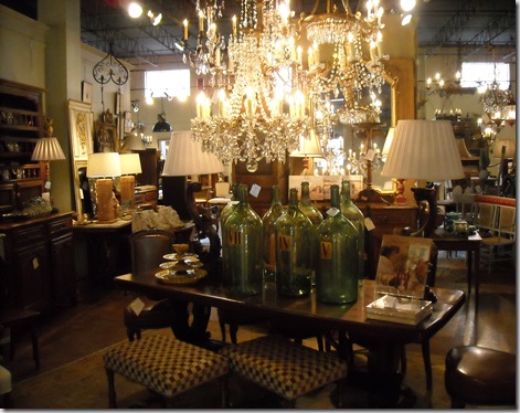
These American (?) examples grouped on a console at Foxglove Antiques really sparked my interest. And then, like the phenomenon that happens when you buy a new car-- before you know it, you’re noticing them everywhere (you know the one?), I began noticing demijohns all over the place…..


image218_thumb


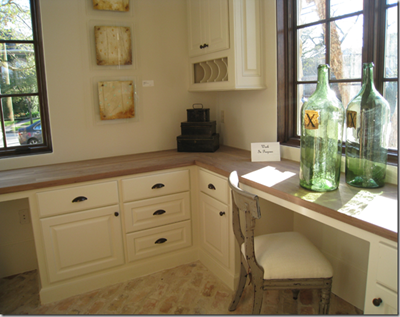
From Cote de Texas’ post on "The Octagon Home", designer Tami Owen deftly placed them where the sunlight streaming though the windows would highlight these beauties.


pritchard-cooke-0508-8_lg-39420313


Still in their original wicker jackets, designer Jillian Pritchard Cooke uses demijohns to accessorize a kitchen counter.


from phoebe howard


Another favorite, Phoebe Howard, places them atop a tall chest. (Not sure if that would work here in earthquake country! )


phoebe howard room lamp


Here, one has been fitted with lamp workings and a simple shade in keeping with the beachy theme of the room.


in pheobe howard bedroom


Smoky gray is an option if the more traditional blue/green doesn’t suit your palette.


ballard collection


Even Ballard Designs has gotten a piece of the market, offering a variety of sizes with covers that include rope, cane, burlap and metal mesh. You can also purchase the lamp adapter kits through them.


I found this wistful image on flickr. Can anyone please send me the GPS location of this field? I’m dying to rescue them!


Sadly, what led to the “end” of the common usage of demijohns in wine production was, what else, taxes!


The Tariff Act of 1824 imposed a hefty tax on demijohns of twenty-five cents each, making it much more economical for winemakers to package in smaller bottles. Leave it to the government to muck it up again!!


Regardless of whether they are old or new, demijohns are beautiful decorative objects with the size, texture, and color to make a statement in any room.

Related Posts with Thumbnails