Friday, August 7, 2009

Scenic Papers


paul montgomery portobelloimage Paul Montgomery Studio


I am mad for scenic wall murals. Not the faux Tuscan trompe l’oeil disasters you sometimes see featured on HGTV and DIY network, but the beautiful landscape scenes a la seventeenth and eighteenth century Dutch masters, and especially the grisaille and sepia toned works that portray historical panoramas.


de gournay henrietta spencer churchill DeGournay Paper


Personally, I prefer the mural to rest atop a chair rail or paneling of some sort as in this bathroom designed by Henrietta Spencer Churchill.


via Mrs. Howard Personal Shopper charlotte store

Photo via Mrs. Howard Personal Shopper


I was thrilled to see that the new Mrs. Howard store in Charlotte includes this lovely sepia toned mural. I can’t tell if it’s painted directly on the wall or if it’s a hand painted paper; either way, it’s gorgeous and I can’t wait to see how they fill the space!


Update: 08/08/09 - The Charlotte room is a bedroom, and as expected, it is lovely. Thank you to Laurie from JMH Interiors for confirming that the mural is actually painted on the wall--beautiful!


martha stewart turkey hill

image via Martha Stewart website


This mural is in the center hall in Martha Stewart’s Turkey Hill home. It was previously a more colorful scene, and was updated in the last renovation. The Empire style crystal chandelier complements it beautifully.


martha stewart center hall


A view from the top of the stairs. I wouldn’t have expected the railing over the mural to work, but somehow, I don’t mind it.


via cdt


These scenic paintings are a natural fit in a formal dining room, where a touch of drama is always appropriate.


Fiona Newell Weeks photo Michel Arnaud

photo credit: Michel Arnaud


Designer Fiona Newell Weeks selected a lovely chinoiserie scenic paper for this very formal and traditional dining room.


via the Paris Apartment

photo via the Paris apartment


A less formal dining room--this delicate painting reminds me of a beautiful linen toile. Maybe that’s why I’m so drawn to them.


hand-painted-paneling


Here, the painting was done directly over paneling. The element of texture that the panel grooves add to the composition is so unexpected and brings down the “stuffiness” factor in the room.


michael smith zuber


A bedroom is also a good candidate for a scenic mural. Here, designer to the White House, and fellow Californian, Michael Smith uses a grisaille paper from Zuber in a small bedroom. The absence of color in the painting results in a backdrop that is more texture than pattern and, although it is a strong element in the room, it does not demand the spotlight.


four seasons maybe milan


From the Four Seasons Hotel in Milan. Do you suppose the scene depicts the Italian countryside?


zuber Les Courses des Chevaux


Les Courses de Chevalier” paper by Zuber. Instead of white or off-white below the chair rail, the designer elected to continue the grey tones down the wall. Grass cloth in a similar shade would work equally well as a wall treatment below the moulding.


deg8-their-website


DeGournay


Scenic with a modern edge.


de gournay

DeGournay


Here, a grisaille panorama goes tropical.


There are several manufacturers of beautiful hand painted panoramic wall papers that I know of. Zuber, DeGournay and Paul Montgomery Studios all have some beautiful offerings. I’m sure there are others. For wall murals, research decorative painters in your area. If you are a skilled DIY-er I found a company that sells stencil kits that look promising here. I tend to try to do things myself, but I’m not sure that I’m talented enough to pull of a wall mural as beautiful as these. Then again, for the price, it might be worth a shot as the hand painted papers can cost a kings ransom. However they are done, these lovely scenes are a wonderful way to add classic beauty to any home.

Sunday, July 12, 2009

What does your front door say about you?


DSCN0560

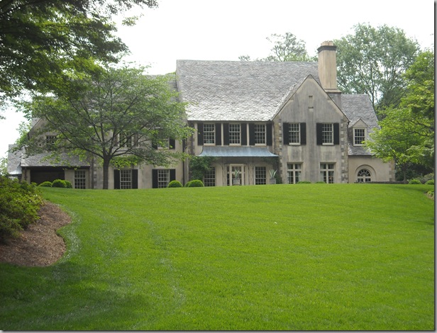
Is it front and center, openly inviting the world in?


DSCN0551

Or does it prefer to remain anonymous, camouflaged by the overall architecture?


DSCN0565

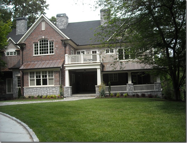
Is it tucked safely under cover?


DSCN0578

Or buffered by a porch?


DSCN0580

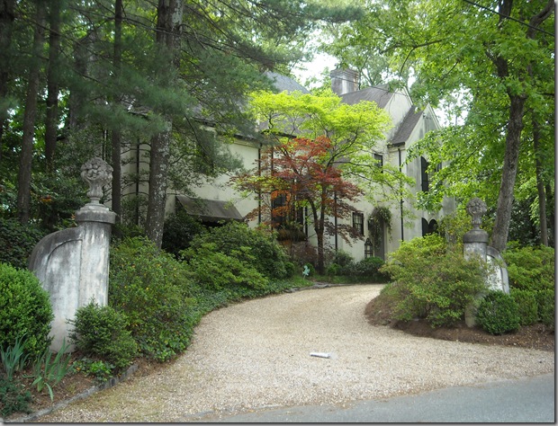
Has it gone incognito, hiding behind the landscaping?


DSCN0583

Or do visitors have to first pass through a garden or courtyard to reach it?


My own front door is on the side of my house, not visible from the street, tucked away under a covered porch that is surrounded by an enormous climbing rose bush.  Hmmm, I wonder what that says about me?!

What does your front door say about you?

Saturday, July 11, 2009

They’re heeere…

On an entirely non-design related note:

fruit_slideshow_peaches

I am so excited my favorite local farmer (Tom Tomich in Orangevale) has started picking this year’s crop of Suncrest peaches. Equal in flavor to O’Henry (which ripens in early August around here), no flavorless grocery store version of a peach can even come close these heavenly delights.

Every year, beginning the day after Memorial day, Tom opens his little stand for the summer. I have anxiously awaited opening day for well over a decade now. Each year, my brood devours bushels (no joke) of Tom’s peaches; in fact, my boys have never even tried a grocery store peach.

Early this morning, we made our weekly visit to the stand and bought his last box of Suncrest. I’m going spend tomorrow peeling and freezing them so that we can enjoy them in the winter too—hard work, but totally worth it. My secret weapon when freezing peaches is the addition of a splash of vanilla to the syrup mixture; it takes away that “freezer” taste completely.

For those of you in the Sacramento area, you can find Tom’s peaches in Orangevale (the stand is on Filbert, just off of Greenback). I guarantee, you won’t be able to eat a store bought peach ever again!

Saturday, July 4, 2009

Closet Envy


bunny williams

photo via House Beautiful

When Bunny Williams and her husband built their vacation home in the Dominican Republic, the design included this “china room.”   At 13 feet wide by 16 feet long, (nearly as big as my actual kitchen) the cabinets have sliding glass doors and are lit from the inside.   Ms. Williams was quoted as saying: “We love to entertain, and setting a table is so much easier when you can see everything! With that island in the middle, I take things out and experiment: Wouldn't this green leaf plate look great with those purple glasses?" 

When I came across this article in House Beautiful, I immediately showed it to my husband and informed him that this is the china closet that I want need someday.  I have only a few vices; one of which is antique and vintage china, crystal and silver; oh and pewter, too.  (There are several others, but that’s a topic for another day.)  This “habit” is a source of contention in my house, but, like any addiction, I can’t help myself….


filoli

My first knowledge of a china closet or “Butler’s Pantry” was as a teenager in the Bay Area, and this was it.  It is located in the Filoli estate in Woodside, CA.   Filoli was built for Mr. and Mrs. William Bowers Bourn, prominent San Franciscans whose chief source of wealth was the Empire Mine, a hard-rock gold mine in Grass Valley, California.  More recently, the exterior of the house was the setting for the television series, Dynasty. 

From the Filoli website

“From the staff's viewpoint, the Butler's Pantry was the operational heart of the house. This room was used to plate and serve the food, wash and store the china and stemware, and to polish and store the silver.  A family member would press a button which would ring a bell and light up the board, indicating the room location, and someone would be sent immediately to that room. The cupboards and safe contain a variety of plates, glasses, pewter and silver. The dumbwaiter in the corner was used to send food and laundry to the second floor. The center table has practical storage for linens in drawers that go all the way through the table. The plate warmer is an original appliance.”

I recall feeling completely awestruck by that enormous safe for the silver.  I could just imagine living so graciously and have dreamed of that way of life since.  (You know, champagne taste on a beer budget….)  At the very least, it sparked in a younger me, an interest in the collection and care of fine china, silver and crystal. 


The household staff were a vital part of life at Copshaholm. The Butler's Pantry contained the dishes and glassware used by the Olivers and guests. The sink was made of German silver, a soft alloy of copper, nickle and zinc, which reduced the risk of brea

The airtight silver vault in the Copshaholm estate in South Bend, Indiana

The pantry that adjoins this vault features a sink made of German silver; a soft alloy of copper, nickel and zinc, which reduces the risk of breaking the dishes during washing.  I imagine a copper or stainless sink might be a suitable alternative today.

Traditionally located adjacent to the kitchen or wine cellar, butler’s pantries first became popular in the 18th century and usually contained counters or tables and sinks and sometimes provided additional food storage.  In Europe, butlers often slept in the pantry as their job was to keep the silver under lock and key.  The wine log and merchant’s account books were sometimes kept in the butler’s pantry. 


atlanta home architects rick spitzmiller and robert norris photo credit Peter Woloszynski

photo credit:  Peter Woloszynski

Today, butler’s pantries are often located in a short hallway between the kitchen and dining room  This allows for easy access to china, linens, glassware and silver and provides a surface to stage meals and set out drinks.  An added benefit is that the central location can provide a sound barrier between the chaos in the kitchen and the meals being enjoyed in the dining room. 


calif. mls photo:  California MLS listing

Tucked between the kitchen and dining room, this space has a wine bottle rack and hanging storage for stemware.  It would make an ideal space for setting up a temporary bar.


pantries02

Here, in what appears to be a converted mudroom, a dishwasher and prep sink have been included, allowing for easy clean up and storage.  Cabinetry reaches all the way to the ceiling, maximizing storage.


architect joeb moore via hb photo credit Pieter Estersohn

In this more contemporary pantry, architect Joeb Moore includes a Viking undercounter refrigerator and ice maker flanking the sink.  The Sub-Zero wine cellar on the left holds 132 bottles.  Stock medical cabinets store glassware and china.


white house bp circa 1920

This is the butler’s pantry in the White House, circa 1920.  Love the sliding window cabinet doors, the tall crown moldings and the brackets “supporting” the wall cabinets.


white house bp3

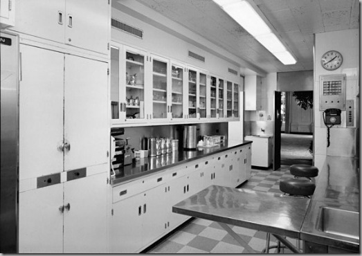
After an update in the 1950’s:  The sliders have been replaced by hinged cabinet doors and the counters are stainless steel.  The lighting has been updated to banks of fluorescents (yich…)   The overall look is definitely in keeping with the era.


white house bp

And a more modern photo.  Still functional, but a much less charming version of it’s earlier self. 


WestchMag_Pantry_B_007

This small pantry area includes one of the “must-haves” for my next kitchen—an integrated espresso machine.  I happen prefer these large shallow drawers to a typical base cabinet configuration.  I find that drawers are as useful as shelving (with the exception being the storage of very tall items), and infinitely more accessible.


Atlanta Pantry Suzanne Kasler photo credit Frances Janisch

photo credit:  Frances Janisch

More walk-in china closet than butler’s pantry, this design by Suzanne Kasler is genius.  I adore the built-in glass front displays on either side of the doors—showing off a favorite collection.   The displays could easily be swapped out seasonally.


blue china closet

Here again, a walk in china closet combines beauty and function.


jason bell via hb photo credit Simon Upton 

photo credit:  Simon Upton

If space doesn’t allow for a full pantry, why not consider a “butler’s wall”?  An elongated storage system spread along one wall, it can provide many of the benefits of a more formal pantry.  To lessen the footprint, base cabinets can be ordered 18” or 21” deep rather than the standard 24” and the distance between the wall and base cabinets doesn’t need to be 18”.  The wall cabinets could sit directly on top of the base or, as pictured above, designer Jason Bell opted to leave about a foot of space between the two.  The great thing (and one of the biggest problems) with cabinetry is that there are so many options.


suzanne rheinstein

This charming butler’s wall belongs to designer Suzanne Rheinstein.  A library ladder is a wonderful addition—especially if you run the wall cabinets all the way to the ceiling.

Unfortunately, the only place in my home that I could refashion into a butler’s pantry is my laundry area—and in my house of boys, reducing laundry capacity is strictly not an option.  So, I’m left holding my dream of having a china room like Bunny William’s.  Maybe someday…..

Friday, June 19, 2009

A bit of consoling….


miles redd cropped

I have always loved console tables.  This Miles Redd vignette reminds me why…. They offer the perfect opportunity for still life, a chance to pause and soak in the moment.  Generally, more about form than function, these narrow platforms can be used in almost any room of the house to display a beloved collection or virtually any other thoughtful arrangement of interesting objects.  Often, the status of even the most mundane items can be elevated by including them in a place of honor atop a console table.


from atlanta re listing cropped

Well suited for symmetrical arrangements, console displays frequently feature a pair of lamps at each end with a mirror centered above and a “centerpiece” item.  This picture from a real estate listing substitutes the lamps with ivy standards and the centerpiece looks to be an antique humidor (I’ve used a humidor as the centerpiece on my own entry table and love the simplicity of it.) 


Ashley Whittaker

In this entry, designer Ashley Whittaker uses a pair of very simple gold candlestick lamps with an equally understated mirror, letting a trio of blue and white urns make the statement.  I think console tables, particularly those with more delicate lines, look best when they have something tucked below to ground or connect them to the floor plane, as the two larger urns do here.


stencil border

Once again, a blue and white themed entry, no lamps, instead a pair of tall vases with a centerpiece of pinecones (one of my favorite fall/winter “go-to” bowl fillers.)


charlotte-moss-study

Charlotte Moss’ Study.  I am always looking for a way to deal with the ridiculous number of shelter magazines  I receive each month.  Although mostly newspapers, this brilliant solution would work equally well with magazines and look cool doing it!  (Okay, that was mostly about the rods, not the console, but it’s sort-of related….)


Anne Coyle

(Image via Cote de Texas)

Speaking of storage, magazines aren’t the only things piling up around here.  With so many fabulous design books published in the past few years, the stacks are getting out of control.  Here’s a solution that I have “borrowed” from designer Anne Coyle, with the hope that I’ll come off as more of a scholar than a pack rat.  Notice how, by leaning the mirror and artwork, rather than hanging it, the console is physically and visually connected to the wall behind.    Also noteworthy;  the mirror is angled just “so” to reflect the lovely chandelier in the background, effectively making it part of the tablescape.  (And, yes, the use of that term does make me cringe a bit since having been adopted by Sandra Lee.)  This collection of books, artwork and objects appears to be casually placed, but it takes a trained eye to get this type of asymmetrical arrangement right.


oversized books

Another asymmetrical design;  I think the placement of the artwork behind the bust is well thought out and very clever.


new orleans designer ned Marshall

New Orleans designer, Ned Marshall expands the footprint of this arrangement by flanking the console display with a pair of side chairs and framed artwork.  This time the table is anchored by an ancient statuary foot—very chic.


Shannon Bowers from veranda

This space, designed by Shannon Bowers, illustrates how a console table can be the perfect solution to “that space under the stairway.”  The antique ceiling tiles make for a highly textural and interesting wall display.  Note how closely they are hung to the table, tying all the pieces together.


vincente wolf own home cropped

In his own home, Vincente Wolf juxtaposes a very classic and ornate marble-topped Louis XVI console with what looks to be a collection from the Museum of Natural History.  Now that is a display that would make me do a double take.


saladino cropped_edited-1

Quiet and lovely, this is how a master styles a console table.  In this space designed by John Saladino, the gorgeous antique mirror is the star of the show.  He uses one of my favorite “under-table” treatments--a petite bench.


veranda cover cropped

I know this cover image from Veranda has been seen a lot, but it’s so pretty, it deserves a second (or third, or fourth) look.  This time, the objects play a supporting role to that beautiful Rococo table.


img_totaleclipse_6

A console table in a dining room is a natural fit.  When needed, it can be called into service to provide extra serving space for large gatherings.  In “times of peace” they dutifully supply a pedestal upon which to display a special piece of china or collection of crystal or perhaps a set of pretty candlesticks….  Rather than using a pair of lamps on the tabletop,  sconces flanking the mirror allow for an easy transition between uses.


Lawrence rizkowsky malibu house root mirror

In this Malibu home,  Lawrence Rizkowsky uses a console as a bar table of sorts.  The show stopping root mirror reflects a lovely scene—the chandelier, the stone mantle topped with a pair of demijohns glowing with the light from an iron sconce—this is such a soothing scene to me.


7-lyonpalm-0509-xlg-28904793

A console table can be an excellent addition to an outdoor space.  The composition is the same, the elements selected to suit the environment. 


David DeMattei and Patrick Wade design their Rutherford home with a mix of Williams-Sonoma Home furnishings and as-found antiques.

A console table is a blank canvas, just waiting to be brought to life by a savvy homeowner or designer.   Easily re-fashioned to suit a season or a whim, a console can often be incorporated into even the smallest of spaces, showcasing a collection or unifying a mishmash of bits and bobbles.   Whether doing double duty as a bar or buffet, or simply providing a beautiful moment of still-life, I think console tables are a great addition to almost any room.

Related Posts with Thumbnails